
Find and narrow
Global navigation leads into filters and a browsable set of options.
Sendoso · Navigation redesign and research practice
A self-initiated navigation study became roadmap work. The first structure reached high fidelity, went through feedback, and was rebuilt around two clearer product contexts before a beta reached 15 customers.

This did not start as an assigned redesign. I began it as a research and exploration effort because the product’s navigation no longer matched the range of work customers needed to do.

I joined Sendoso at seed stage as its first design hire and a Senior Product Designer. I was an individual contributor throughout my time there. My job was to design product work, not to manage the design team. As the team later grew past 12 designers, I sat on the interview panel for the first two or three hires.
Sendoso is a B2B sending and gifting platform. By its Series C, the company reported more than 800 global customers and more than 20,000 global users. It raised a $100M Series C led by SoftBank Vision Fund 2 and more than $152M in total funding. That growth changed the product surface. What had worked for a smaller platform had to carry more modules, more roles, and more frequent tasks.
I parsed the existing information architecture and the product roadmap into discrete actions, then used those actions to examine how people understood the product. I presented the resulting insights and potential improvements to management. The work was accepted onto the roadmap.
Once it became roadmap work, I collaborated with the Design Manager, VP Design, UX Research Lead, Head of Product, a UX Researcher, and a Product Manager. Those titles matter because the work crossed product strategy, research, visual design, and engineering delivery. The direction was shaped with the team, while I remained the hands-on designer.
The problem was not simply that the navigation looked old. Users described a mismatch between the menu and the work they were trying to do.
Those issues pointed to information architecture, task context, and responsive behaviour at the same time. A cosmetic adjustment would have preserved the original assumptions. The structure needed to be examined before the interface could be redrawn.

The three-month plan had three phases. First came observation, research, and analysis. Next came requirement gathering, user stories, and use cases. The final phase covered wireframes, the design system, and interface design across five sprints. That sequencing kept the visual work behind the information architecture instead of letting it decide the architecture by accident.
I converted the current structure and planned product work into cards. Users and internal experts grouped those actions in whatever way made sense to them.
The mix mattered. Internal experts understood the roadmap and operating model. Power users knew the product through repeated use. Naive users brought fewer learned assumptions. The study was not asking one audience to stand in for all three.
I thought of these groupings as jigsaw pieces that research handed to design, product, and engineering for assembly. The study did not produce a menu by itself. It produced evidence about which actions people saw as related. The product team still had to decide how those relationships should behave across browsing, focused work, roles, and devices.

I also reviewed Reachdesk, Alyce, Postal.io, and Snappy. The comparative analysis helped distinguish category conventions from Sendoso-specific decisions. It was an input, not a vote. The final structure had to fit Sendoso’s actions, roadmap, and customer language.
The first direction organised the product around moving from navigation into a browse or build path.
NAV → BROWSE → DETAIL → ACTIONSNAV → BUILD / CREATE → PREVIEWBrowse: NAV → FILTER → BROWSEFocused: OVERVIEW → DETAILSI took the first structure into low-fidelity wireframes and then high fidelity. The high-fidelity work included default and minimized navigation states. That was not the end of the process. After testing and feedback, the direction went back to the drawing board.

I do not have the detailed test findings that triggered the rethink, so I will not reconstruct a convenient explanation after the fact. What is documented is the sequence: the first model reached high fidelity, it was tested, and the team rebuilt it around a browse context and a focused context in response to feedback.

That is the judgment I would want a hiring team to notice. High fidelity was not treated as proof. The work could move backward in visual completeness when the structure needed to move forward in clarity.
The rebuilt model separated finding and filtering from working inside a selected area.
In the browse context, the sequence became navigation, filter, and browse. In the focused context, it became overview and details. This did not claim that every product task was identical. It created two legible modes that could contain different modules without forcing all of them through the same path.
New wireframes followed. The team reviewed the structure internally, I produced a final wireframe, and the work moved into interface and visual design. The complete direction also included a before-and-after comparison and mobile treatment.

The shape of the change is more useful than a polished retrospective story. The first model emphasized routes through the product. The second emphasized the context a person was in. That difference gave the interface a stronger basis for deciding what should remain global, what should be filtered, and what belonged to the selected object or task.

Global navigation leads into filters and a browsable set of options.
An overview leads into the details of a selected area or object.
The source screens for the low-fidelity direction, first high-fidelity state, rebuilt wireframes, final comparison, and mobile treatment are not included in this site package. I have kept the case study honest by showing the documented structure rather than drawing replacement product screens and presenting them as historical artifacts.
The navigation was one part of a broader system that had to hold from 1536 pixels down to 320.
The primary navigation moved from a 2xl desktop layout through smaller breakpoints to an xs mobile layout. The full Sendoso wordmark reduced to the “S” mark as space tightened. That behaviour was specified rather than left for engineering to improvise.
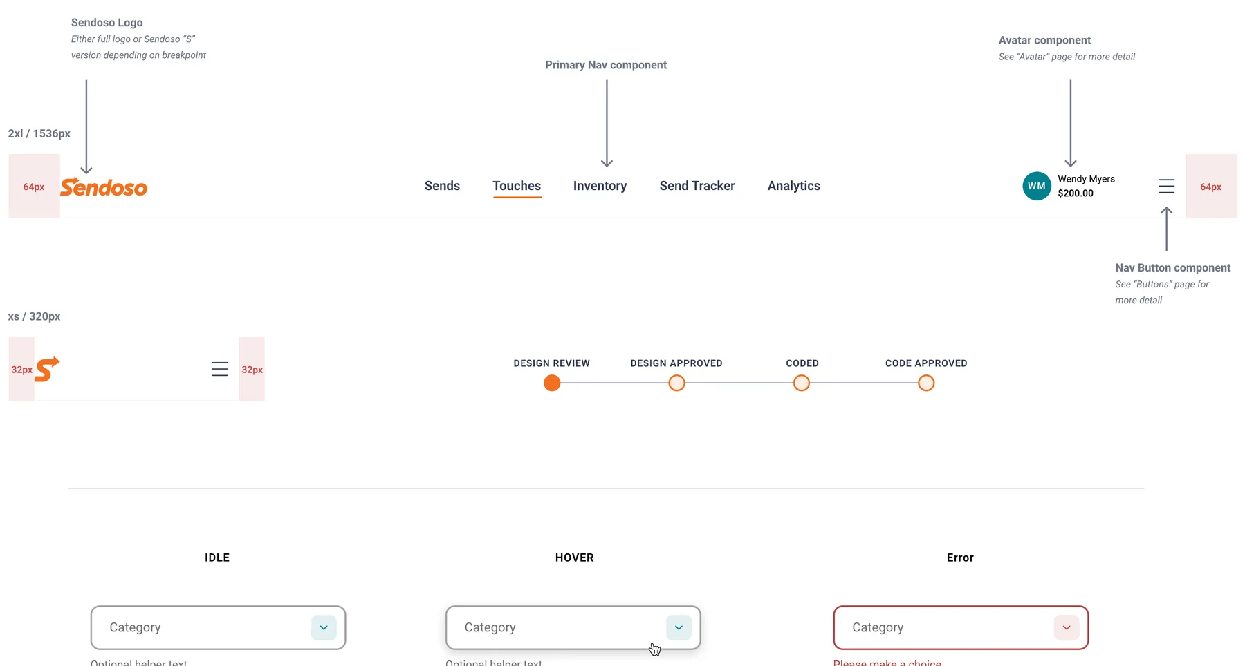
Primary navigation and brand treatment defined across the full range.
Idle, hover, focus, active or pressed, disabled, and error states.
Avatar, navigation button, form field, pill, product card, and category card.
Design Review → Design Approved → Coded → Code Approved.
The system used Tailwind-style naming such as tertiary-50, neutral-400, text-base, and text-sm. Product and category cards had defined aspect ratios and truncation rules. Those details kept the system from becoming a collection of screenshots that only worked at one width or with one length of content.

The state coverage mattered as much as the component list. A navigation component without focus, disabled, and pressed behaviour is not ready to hand off. A product card without truncation rules becomes a layout exception as soon as real content arrives. The system documented both.
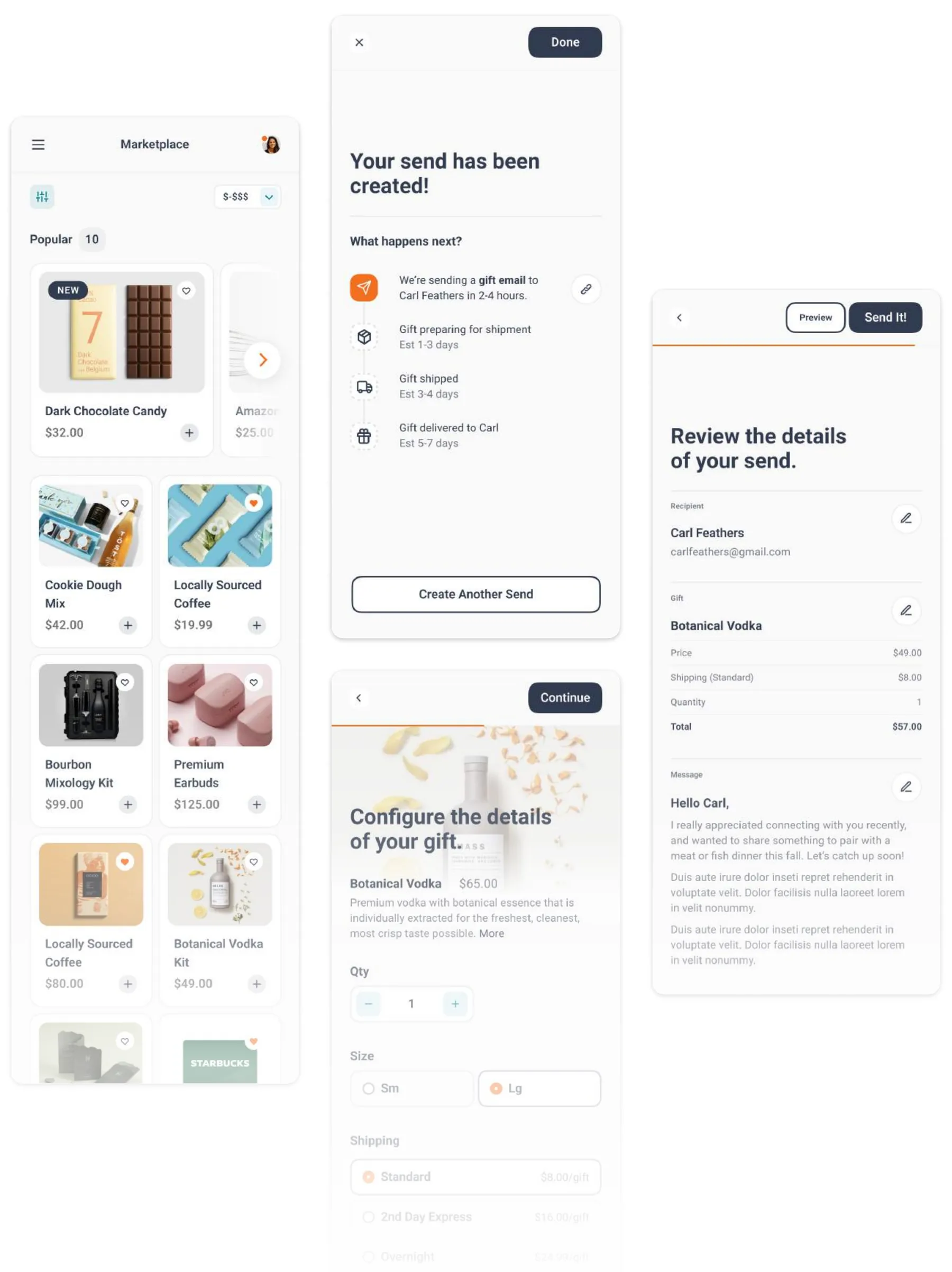
Sendoso did not have an established usability-testing practice. Design and UX research worked together on a foundation for self-service research, including reusable test-script, coding, and synthesis templates.
Two studies ran in parallel: Sender view and Recipient view. A UX researcher led them, and I consulted alongside another designer. I co-wrote hypotheses for 13 sender questions and eight recipient questions. Each hypothesis recorded a position before testing, so the team could compare what it expected with what participants did. I also ranked features as must-have, nice-to-have, or out-of-scope. That prioritization was a dependency for the researcher writing the test script.
I built the fully clickable prototype. This was a formal blocking dependency: the researcher could not run or iterate the script until the prototype existed. Testing ran on UserBrain.

I predicted that letting senders customise the email, landing-page message, and gift note would create too many input fields and blur what each message controlled.
My preferred option was to hide unavailable sizes. I also acknowledged that showing the limitation early was better than letting a person discover it at checkout.
Without clear branding, the email could look like spam. The sender’s identity helped the recipient understand why the message was legitimate.
We tested three recipient layouts. I argued that removing both the product image and name could deaden the experience and suppress address confirmation. A generic gift image could preserve surprise without making the message feel empty.
This work did not prove that one designer had all the answers. It created a repeatable way to state a position, build a testable experience, observe behaviour, and synthesise what changed. That was the foundation the company needed to begin testing more consistently.
The designs were approved and handed to engineering. A feature-flag beta launched to 15 customers on 15 June 2022.

The team was satisfied with the initial customer response. Full rollout was planned for Fall 2022. I left Sendoso in July 2022, before that rollout, so I cannot claim post-launch adoption, retention, or satisfaction results.
That boundary is part of the outcome, not a footnote. My contribution was the self-initiated research, the navigation structure and its rethink, the responsive system, approved handoff, and the beta that shipped while I was still there.
The project is also a useful record of how I work. I can create a mandate instead of waiting for one. I can carry a direction into detailed design without becoming attached to the polish. I can state where the evidence ends. And I can turn a structural change into a component and review system engineering can use.