
I designed a bank’s travel platform alone and shipped it in four months.
Designed a white-label travel platform for one of Egypt’s largest private-sector banks. Customers can book flights, hotels, car rentals, and experiences using the bank’s cards, reward points, or both, all within the bank’s secure digital environment.

01The problem: a loyalty programme customers could not use
One of Egypt’s largest private-sector banks faced a loyalty programme challenge: cardholders accumulated significant reward-point balances but had limited redemption options.
Unredeemable points undermine loyalty, create customer frustration, and sit on the bank's books as a growing liability. To address this, the bank launched a travel platform within its secure banking environment, enabling cardholders to book travel and pay with their card, reward points, or both. Card tiers provided additional benefits, including annual free checked baggage.
Why did the bank invest in this?
- A new revenue stream built on travel commerce, one of the highest-spend categories for its cardholders.
- Redemption gives points tangible value, turning an idle liability into something people actually use.
- Retention. Travel benefits tied to the bank’s cards give customers a reason to stay and spend more.
Without this solution, the loyalty programme would continue to underdeliver, and the bank’s most valuable customers would book travel through unrelated platforms.
What was actually being built
This was not a typical consumer travel website. It was a white-label, API-first B2B2C platform designed for rebranding and configuration by other banks and enterprise clients, each with unique loyalty logic, card benefits, supplier mix, and branding. The architecture was built to support future tenants beyond the initial implementation.
Two integrated products were delivered: a customer-facing travel shop for searching, booking, and managing trips, and a role-based admin portal for operations, customer support, finance, loyalty, and reconciliation.
My role
As the sole designer contracted through an agency, I managed the end-to-end experience for both products, including journey mapping, responsive web and mobile layouts, bilingual design, the design system, edge cases, transactional emails, vouchers, and the operations portal. I worked closely with the bank’s teams, travel suppliers, and engineering to integrate API, certification, and compliance requirements into a cohesive customer experience.
For example, during integration, a change from the primary flight supplier required a rapid rewrite of booking flows. I organised joint workshops with the bank’s engineering team and the supplier’s technical leads to clarify the new API structure and define the revised customer journey. By collaboratively mapping the new data flows, we resolved conflicting requirements and kept the launch on schedule. This cross-functional work kept the experience coherent under tight deadlines.
The user problem
Cardholders lacked a clear way to understand or use their travel benefits. Planning a trip required switching between systems to check points, search, verify entitlements, pay, track bookings, and seek assistance. Free checked baggage, tied to card tier, was not visible during booking when it was most relevant.
The design problem
The initial brief was to enable customers to book travel with points. In practice, the challenge included live inventory changes between search and payment.
- Multiple suppliers, two flight APIs over the life of the project, a hotel supplier with a formal certification process, plus car rental and experience providers, each returning different and inconsistent data.
- Three payment options: the bank’s card, points, or split payment, with automatic points-to-cash conversion so customers never need to calculate it themselves.
- A benefit that may not always apply: free baggage could be granted, already included by the airline, or rejected by the supplier, depending on fare, route, and passenger mix.
- Delayed confirmations: payment could be processed before the airline issued the ticket.
- Two languages and two reading directions at full parity, with both languages offering equal features and quality, and terminology reviewed by the bank.
02What I could learn in the time I had
The tight deadline did not allow for a traditional discovery phase. Instead, I conducted a structured benchmarking programme, using leading travel products as reference points for usability and design best practices.
I analysed more than ten leading travel products across flights, hotels, and car rentals. For every product, I documented why it was selected, what patterns were worth borrowing, and which products I rejected and why. To visually compare feature coverage and suitability, I created a comparative matrix mapping which competitors supported each travel vertical and how they performed against key criteria. Selection criteria were explicit: mobile-first quality, Arabic and RTL maturity, and relevance to a bank-embedded audience in Egypt, not simply global popularity.
| Product | Flights | Hotels | Car rentals | Packages |
|---|---|---|---|---|
| Kayak | Supported | Supported | Supported | Supported |
| Expedia | Supported | Supported | Supported | Supported |
| MakeMyTrip | Supported | Supported | Supported | Supported |
| Skyscanner | Supported | Supported | Supported | Not supported |
| Almosafer | Supported | Supported | Supported | Not supported |
| Google Flights | Supported | Supported | Not supported | Not supported |
| Hopper | Supported | Supported | Not supported | Not supported |
| Alternative Airlines | Supported | Not supported | Not supported | Not supported |
| Holiday Factory | Not supported | Not supported | Not supported | Supported |
| Nusuk | Not supported | Not supported | Not supported | Supported |


Shared interaction patterns
Extracted from the benchmark set and reused across every module, so a customer who learns one already knows the next.
- Tabbed navigation across flights, hotels, cars and packages
- One search bar with minimal fields: location, date, guests or passengers
- Persistent filters that do not interrupt the scroll
- Deal urgency tags, such as low remaining seats or a price drop
- A booking summary and review step before payment
- Consistent card layouts: image, rating, price, action
- Fast mobile response with the fewest possible clicks to book
What the research produced
Actionable insights from benchmarking directly shaped the platform’s core design patterns. By systematically analyzing leading products, I identified interface structures such as tabbed navigation, persistent search fields, and a consistent review step before payment, which were applied across all travel modules. These shared patterns enabled efficiency and a unified user experience. Documenting rejected approaches also provided stakeholders with clear reasoning for design decisions, ensuring only relevant, proven patterns influenced the final solution.
The research identified shared patterns that became the platform’s foundation: tabbed navigation, a simple search bar, persistent filters, a review step before payment, consistent card layouts, and minimal clicks to book. Extracting these patterns across verticals enabled the key structural decision: a shared journey skeleton for every travel module.
Documenting rejected options was as important as documenting selected ones. Expedia and Wego were excluded due to clutter and excessive ads for flights. Booking.com and Agoda were rejected for crowded mobile flows and outdated hotel patterns, while Turo was not a fit for car rentals. Recording these reasons ensured transparency and provided stakeholders with clear justifications for design choices.
03Six things that were fixed before I started
A bank-driven deadline
A mid-project platform pivot
Brand guidelines enforced to the atom
Supplier reality
Banking and loyalty complexity
Full Arabic parity
The bank required a non-negotiable launch within 4 to 5 months. Every decision balanced product polish with the need to ship on time.
The project began with a mobile-first approach. When desktop became the primary launch target on short notice, the web experience had to be designed quickly while maintaining consistency with mobile.
The bank’s brand guidelines were strictly enforced, covering colors, typography, and tone. With limited creative flexibility, differentiation relied on flow quality rather than visual innovation.
Flight fares arrived with incomplete rules. Price revalidation could take seconds or fail. Tickets could be issued after payment, leaving bookings in limbo. Baggage options sometimes applied to the whole journey but not to individual legs. The hotel supplier required a formal certification sequence: availability first, then a rate re-check, then booking, with strict data requirements at every step. Cancellation rules varied by rate, route, and supplier. Mid-project, the primary flight supplier changed, so the flows had to absorb a new API’s behaviour.
Three payment paths, points-to-EGP conversion, card-tier entitlements, customer-protection messaging, and visible fare conditions before payment. All were mandatory and reviewed by the bank’s compliance team.
This was not just a translation layer, but a second directional system: mirrored navigation and icons, right-to-left calendars and carousels, mixed-language branding, and Arabic strings that challenged layouts originally designed for English.
04Six decisions that shaped the product
For each one: what was on the table, what I chose, and why the alternatives lost.
One journey skeleton for every travel vertical
What I rejected: Designing each module around its own supplier’s data model and conventions. It would have produced three products with a single logo and tripled the design and engineering surface area under a four-month deadline.
What I chose: A shared structure for every vertical: search, results, filters, details, selection, traveler information, payment, confirmation, and post-booking. A customer who learns one module already knows the next, and new modules inherit the pattern instead of inventing one. Benchmarking confirmed that leading multi-vertical products follow this strategy.
One design system, two typography configurations
What I rejected: Building two separate design systems, since the bank mandated different fonts for mobile and desktop. Two systems mean double maintenance and guaranteed drift under deadline pressure.
What I chose: A scalable system with typography as a configurable token layer. Font differences were handled through configuration, not separate systems. This approach supports future tenant customization, aligning with white-label platform requirements.
The free baggage benefit: design for partial failure, not just success
This was the bank’s flagship feature and the site of the project’s biggest pushback. The technical reality was that the benefit could not always be applied. Sometimes the airline already included the bag, sometimes the supplier accepted it, and sometimes it silently failed and had to route through the back office.
What I rejected: Showing the benefit only when the system could guarantee it. Safe, but it buries the perk that the entire programme was marketed on. I also rejected always promising it and cleaning up in support. A benefit that unpredictably vanishes is worse than no benefit.
What I chose: Communicate the benefit in value terms ("Free extra baggage, save up to X EGP, available through your card benefit"), apply it when possible, and provide a clear fallback. Confirmation pages and emails specify whether the benefit was applied, and a structured claim process allows customers to recover costs if they pay at the airport. This area received the most iteration with the bank.
Module-first admin portal, not role-first
What I rejected: A separate portal per role: bank finance, bank loyalty, platform operations, customer support, and tenant admin. Six tailored products would drift apart and multiply every future change by six.
What I chose: Design each module as a master version, then tailor role experiences through permissions such as navigation, table columns, tabs, actions, and export rights. This approach provides a single source of truth per capability, supports multi-tenancy, and is maintainable by a small team.
Honest labels over optimistic ones
Where automatic booking modification was not technically supported, the tempting move was a "Modify Booking" button quietly backed by manual operations.
What I chose: "Request Modification" instead, featuring an eligibility check, structured form, one active request per booking, and visible status tracking through a support-connected workflow. This label avoids promising instant results the system cannot deliver, ensuring the interface aligns with operational capabilities.
Design loading and uncertainty as content, not interruption
What I rejected: The default spinner until timeout. In travel, silence during a delay feels like something has gone wrong with the customer’s money.
What I chose: A three-stage loading pattern: standard ("Checking the latest price and availability"), extended ("This is taking a little longer than usual"), and failure with a recovery path. An explicit price-change dialog displays the old and new totals, allowing customers to accept the new price or search again.
05The customer experience, payments, and failure states
The platform is accessed through the bank’s login and immediately recognizes the customer’s identity, points balance, card tier, baggage entitlement, and language. This context informs all subsequent interactions, eliminating the need for repeated entry or guesswork.

Flights
Supports one-way, round-trip, and multi-city searches. Traveler composition includes validation rules such as infant-per-adult limits and age categories. Features include a calendar with indicative pricing, filters for stops, price, bags, times, and airlines, and clear separation of outbound and return selections. Fare packages are compared by baggage, changeability, and refundability. Passenger forms match passport requirements, and fare conditions are presented before payment to protect customers.


Hotels

Enables multi-room, multi-occupancy searches. Supplier board types are translated into five clear meal-plan categories. Refundability is shown in three color-coded states: fully refundable, partially refundable, and non-refundable, based on actual policy data. Lengthy supplier remarks are restructured into concise bullet points. Sold-out scenarios are communicated in plain language with clear next steps.
Car rentals

Applies the same journey structure with vertical-specific details: transparent daily pricing, deposit visibility, insurance inclusion, and clear pickup and drop-off processes.
Payments in the customer’s own terms
The payment step offers three options: the bank’s card, reward points, or split payment. If points are insufficient, the option remains visible but disabled, and split payment becomes the default. The system calculates and displays the exact breakdown: points used, cash equivalent, card amount, and total, so customers do not need to convert currencies. Card payments are processed through a secure hosted page, with clear pending, verified, and failed states.

The card-tier benefits, end to end
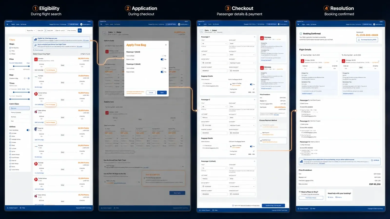
Failure states are core journeys
The product includes twelve defined booking states, from Requested and Processing to Confirmed, Payment Failed, Points Redemption Failed, Timed Out, and the full refund lifecycle. Each state features a clear title, plain-language explanation, and next steps. Delayed ticketing, where payment is cleared but the airline has not issued the ticket, is transparently communicated. Over 25 edge cases were proactively designed, not left to be discovered in production.


06After the booking: operations, Arabic, and the system
Post-booking that respects the customer
The My Bookings area covers upcoming, past, and cancelled trips, baggage claim history against the annual allowance, and self-serve options for date changes, room and board changes, guest information updates, added baggage, and cancellations with penalty visibility. Where automation is not possible, a manual request flow with two-way status updates is provided.

The operations portal
The admin portal absorbs operational complexity, keeping the customer experience simple. Operations and support roles can locate bookings, edit permitted data, cancel, process refunds, resend vouchers, review baggage claims, add notes and attachments, and manage manual modifications with full audit history. Bank roles have view-only dashboards for reconciliation, including booking amounts, points redeemed, benefit utilization, and reversals. A group-level overview offers cross-tenant visibility, supporting the platform’s multi-tenant design.
Arabic as a first-class product
Arabic was intentionally designed, not just translated. This included right-to-left page flow, mirrored icons, Arabic calendar behaviour, carousel direction, mixed-language branding rules, and layouts tested for longer Arabic strings. Common travel terms like "refundable" or "points redemption" required precise contextual translation to avoid confusion, as direct translations could have different legal or financial implications. The bank required contextual review of all translated content, and the design process accounted for this review loop.

One design system, continuously refined
A single component library supported the entire platform, including search inputs, date and traveler selectors, flight, hotel, and car cards, fare packages, room-rate cards, points and cash displays, benefit cards, status indicators, loaders, empty and error states, payment options, price breakdowns, admin tables, drawers, and modals. Each component adapts for English, Arabic, desktop, and mobile from a single source of truth. Accessibility was prioritized, targeting WCAG AA standards where practical, including contrast, focus states, touch targets, consistent validation, and status indicators not reliant on color alone.


07What shipped, and what I would change
Full production analytics were unavailable during my engagement, so I am not presenting estimated conversion or support metrics. The verifiable outcomes are that the first two modules launched to real customers on deadline, passed formal supplier certification, the contract ran its full term, and the project scope expanded after launch.
- Flights and hotels, the first two modules, went live to real customers in four months. It was designed, certified, built, and launched within the bank’s deadline.
- Stakeholders were pleased with early booking performance, leading the bank to extend the project’s scope. Car rentals, experiences, and additional modules entered active design and delivery after launch.
- The contract ran its full term on the strength of that first release, with continuous module delivery throughout.
- The platform passed supplier certification, including the hotel supplier’s formal API sequencing and data standards. This was a hard external quality gate, not a self-graded one.
- As the only designer, I delivered 140+ desktop screens across four travel verticals, the complete mobile experience, full English and Arabic parity, 12 booking states, 25+ designed edge cases, the transactional email and voucher suite, and the role-based operations portal, all on one scalable design system.
- The white-label foundation now enables new bank and enterprise tenants to be onboarded without a redesign. Subsequent onboardings demonstrated the value of configurable product flows, allowing tenant-specific adjustments without major UX or engineering changes. For example, one tenant required local card benefits and branding, which were addressed primarily through configuration, reducing time to launch and risk. Thorough documentation and launch checklists accelerated and standardized each rollout, while tenant-specific testing and review remained essential. The architecture was designed to outlast its first client, and it continues to do so.
What I would do differently
With more time, I would have conducted additional research with actual cardholders before finalizing flows. The compressed benchmarking approach was appropriate given the deadline, but more user validation would have further refined the product and reduced later iterations, particularly for the baggage benefit. After launch, feedback from internal users and customers, gathered through support interactions and post-booking surveys, directly informed improvements such as clarifying baggage benefit displays at checkout and refining the booking modification flow for greater transparency. These insights validated earlier decisions and guided updates to address areas where customers needed more clarity.
What this project taught me
Failure states are core journeys. In live-inventory products, the error, pending, and recovery experiences carry more trust than the happy path. They deserve equal design attention.
Loyalty value must be explained, not just displayed. Showing a points number is not the same as showing what it is worth, what benefit is being used, and what it costs the customer’s annual allowance.
Supplier data should never dictate the interface. API labels, board types, and error codes need a customer-facing interpretation layer. That layer is the product.
Complex B2B platforms still owe customers a simple experience. Nobody booking a holiday should feel the webhooks underneath.